I plan to do a much larger post specifically on some of the ad networks later on but after a Twitter exchange today I wanted to write a short post about setting up an ad campaign. I've had some moderate success with ad campaigns using Project Wonderful so I feel like I have learned something about what works and what doesn't.
DO target sites or keywords related to your business such as: handmade, etsy, crafts, jewelry (if that's what you sell), or bath and body (again if that is your product type).
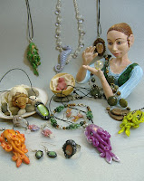
DON'T target an unrelated keyword just because it's popular. Project Wonderful has a lot of web comics offering advertising space so "comics" is a very popular keyword. However if your products are unlikely to appeal to comic readers you're wasting your money using that keyword. I sell cephalopod related jewelry so I do advertise on some comics with octopus, squid, or Cthulhu as characters because people who like those types of comics are likely to also like my jewelry.
DO monitor where your clicks are coming from, a site that sends you a lot of visitors (especially if those visitors also shop) is worth extra to keep your ad on the site. This only works with a service that allows you to select specific sites to advertise on though.
DON'T keep your ads on a site that isn't sending clicks. It doesn't matter how many pageviews it gets, if no one is clicking on your ad then it's not worthwhile.
Saturday, December 27, 2008
Friday, December 26, 2008
Quick Tip #2 - Mini Cards
Several custom printing services such as Zazzle and Moo now offer mini cards, these are 1"x3" cards similar to business cards but much narrower. These are a perfect side for custom tags! Just make sure to design them with space at the end to punch a hole and use ribbon or string to attach them to your products.
Tuesday, December 23, 2008
Is the Recession a Benefit for Handmade Businesses?
I don't have the answer to that question, it's much too big and complex for me as a single businesswoman to draw a firm conclusion just from my experience and talking to other business owners. My sales this holiday season have been much more than I expected and I don't know if that's a result of more people buying handmade or the effect of my marketing efforts or luck or some combination of that.
However one writer for the New York Times does think that the recession and people wanting to save money has had the effect of helping craft businesses and suppliers. Go check it out here: For Craft Sales, the Recession Is a Help
Wednesday, December 17, 2008
Quick Tip #1 - Fee Calculators
If you accept paypal payments this is a great PayPal Fee Calculator. There's also one for Etsy but I've yet to find one for Google Checkout so you still have to do that math yourself.
Sunday, December 14, 2008
My Thoughts on Business Cards
If you read my site review of Zazzle you know how happy I am with my new business cards. Why have a business card though? My business is online you say, I do lots of marketing online. That's true but I don't want to limit myself to just marketing online. For example I often wear my jewelry designs when I go out and if someone compliments them I want to be able to hand them a card. So what do I need in a business card? Contact information of course, it needs to communicate what I do well, and it needs to be memorable.
So lets break down my card:
Business Name - Not surprisingly I put Noadi's Art in the biggest font size on this card. I used the same font for this as I do on my website for the title, partly because I love the font and also to have consistency in my designs. I also picked a gray-blue color instead of black to soften the look a little and pick up on the background of the photo.
Description - I wanted to keep the description simple and too the point so I listed what I sell with the cuttlefish jewelry first because it's my most popular item but also kind of funny. I used the italic version of the font I used for the contact information.
Contact information - Since I sell primarily online I listed my web address and email prominently under my name and put my address and phone number at the bottom.
Image - I wanted to pick a photo that was beautiful and illustrated my work well. I didn't take the cup full of cuttlefish photo specifically for the card but it really turned out to be the most perfect for that spot.
Back of card - This photo I did take specifically for the card, I wanted to show a wide variety of things that I make and my sorceress sculpture made a nice centerpiece for it.
Here's the business card template I used. I loaded it into the GIMP (a free open source image editor) as the background layer and built everything on top of it to make sure the positioning worked well and then hid it with a solid white layer. I kept the original file with all the layers in case the next time I have cards printed I need to change anything, then I exported it as a .jpg at the highest quality setting so it would be nice and crisp then uploaded to zazzle to make my card.
Links to articles on designing cards:
Business Card Design in Photoshop Video Series
10 Step Guide to Designing Awesome Business Cards
Leave a Creative Calling Card
10 Steps to a Stupendous Business Card
Here are a few ideas for using your business cards:
- Include you business card in all orders
- Fill a basket or card holder for people to take one at art/craft shows
- Post them up on public bulletin boards and other places that let you leave your card (or a small stack of them)
- Include your card with everything you mail out. I've even heard of people including them with their bills!
- Get your friends and family involved, have them post your card where they work or have a few to hand out. My mom is a teacher and since my jewelry often appeals to science teachers she has some cards to hand out at conferences.
- To sum it up, don't be stingy! Hand out your cards all the time, if someone asks for extras give them extras. You want as many people as possible to know about your business.
Monday, December 8, 2008
Creative Packaging Ideas - The Basics
This will be an ongoing series because I really think having great packaging helps a handmade business stand out and be memorable to your customers (you want repeat business right?).
This post is on the basics of what I think is important for good packaging. Make sure you check out my Squidoo lens Make your Handmade Products Stand Out! Using Creative Packaging for even more ideas.
The photo to the right shows some of the packaging that I use. It's a mix of fabric gift bags and boxes but you can see that they have a consistent look to them. There are many ways to package your products depending on what you are selling. Small bags and boxes work well for small items like jewelry, paper strips wrapped around handmade soaps with a label are simple but look great, if your products come in a jar or bottle have custom label stickers printed up for them, custom tags for fabric items, the possibilities are endless. Wander around your favorite store looking at how products are packaged or check out the Die Line blog for ideas.
General Tips
- Include photos of your packaging in your shop, let your customer know how their items will arrive.
- Plan your packaging ahead of time and keep all your packaging materials organized in one place (I just use a large box).
- Keep things looking consistent, I don't mean everything has to be the same, but the style and theme of your packaging should all have a similar feel.
- Make the product and packaging match. If it's retro styled give the packaging a retro look. If it's Victorian don't put it in a tied-dyed box.
- Make it professional. Make sure glued items don't have edges sticking up, corners aren't ripped off tags, all text is correct and spell checked.
Saturday, December 6, 2008
Site Review: Zazzle
For my first site review here on Handmade Biz I'm going to cover a site that doesn't let you sell handmade products directly but has some very useful services for your business.
Zazzle.com is a print on demand site that also lets you sell your designs through them and make money. This is especially useful for those working in 2D media like pencil, paint, or digital art in that you can offer your artwork for sale on a wide variety of products at no direct cost to you. It's a fun additional way to promote your art work.
Zazzle offers a really wide and unique variety of products to put your designs on from clothing to bag to cards to skateboards. They even offer embroidered designs though those require an upfront artwork processing fee. When you sign up you get your own customizable storefront, you can take a look at Noadi's Art on Zazzle to see my store as an example. The way you make money on Zazzle is when you create products with your designs you can add them to the marketplace (which will put it on your store along with in Zazzle's search) and put a percentage markup over the base price on each product, if someone buys one you get that percentage. When you make products to buy yourself you pay the base price.
What makes Zazzle really useful for a handmade business is their paper printing options, they offer business cards, postcards, greeting cards, stickers, and postage. All of these can be used to create your own promotional products which is exactly what I used Zazzle for this week. You could also make custom t-shirts to promote your business and wear them to craft shows.
I was running out of my home printed business cards and decided that I really wanted some that looked more professional so I looked around at different online printing services and not surprisingly there is a huge range of prices available depending on quality of the cards and whether you want color and two-sided printing. I wanted full color with two sides and Zazzle's prices were pretty good and I already had an account with them so I decided to give them a try.
First I had to design my cards. Zazzle has pre-made templates already that make designing a card really easy or you can upload your own images and then you can add whatever text you want. I wanted a little more control over my design than that so I downloaded a business card template and used my own photos and the Gimp photo editor to design my card. I then uploaded my images and deleted all the text boxes that Zazzle puts in automatically for business cards.
I went through the order process, Zazzle was having a half-off promotion for business cards so I only paid $25 for 300 cards which was the lowest price I found for 2-sided full color printing, even the full price of $50 for 300 was in the middle of the price range I found. You can find much cheaper business card printing but those usually restrict your design choices and/or put their logo on your cards.
I was given a delivery estimate of 6-10 days after printing. Printing apparently doesn't take very long because they shipped the next day and I received them in only 4 days which is impressive considering I'm on the other side of the country from Zazzle's headquarters.
So my opinion of the cards? They are gorgeous, the cards are a nice weight of cardstock, a satin finish (just a little more glossy than matte), colors are bright and the images are very crisp not grainy. Overall I'm very impressed.
Friday, December 5, 2008
Photographing Your Work Part II
This part of the series we're going to talk about setting up the display for your jewelry before you photograph it.
Backdrop
You don't want to be taking your photos against a background that makes your work look terrible so a good backdrop is important. They're also very simple to create. The best backdrops are either fabric or paper because they are the easiest to handle and find. The best backdrops are simple, a solid color or subtle pattern/texture is best to not distract from the object being photographed. Colors shouldn't clash with the object being photographed either, I recommend neutral or soft colors because you can use them with the widest variety of colored objects so you won't need multiple backdrops.
Props
You can of course just photograph your work against the backdrop and I do that often but props can really help show off your items well. Here are some options you can try:
The next part of this series will talk about composing your shots.
Photographing Your Work Part I
Backdrop
You don't want to be taking your photos against a background that makes your work look terrible so a good backdrop is important. They're also very simple to create. The best backdrops are either fabric or paper because they are the easiest to handle and find. The best backdrops are simple, a solid color or subtle pattern/texture is best to not distract from the object being photographed. Colors shouldn't clash with the object being photographed either, I recommend neutral or soft colors because you can use them with the widest variety of colored objects so you won't need multiple backdrops.
Props
You can of course just photograph your work against the backdrop and I do that often but props can really help show off your items well. Here are some options you can try:
- Display stands. Most jewelry supply stores sell display stands for necklaces, bracelets, etc.
- Dishes. I use a pretty wine glass to hang earrings from in my photos, you can also use bowls, jars, etc.
- Books. A stack of nice hardcover books or an open page can make an interesting display.
- Branches, driftwood, etc. Hang ornaments from a branch, drape a necklace over a piece of driftwood, there are plenty of interesting ways to use these natural items.
- Rocks. A pile of river pebbles or a large smooth rock would contrast well with metalwork jewelry.
- Dressforms and Mannequins. If you create clothing you can either get a model or use a stand-in. In particular many people are squeamish about buying hats that have been modeled on a real person.
- Fabric. Tulle netting can be used to hang earrings from, you can run a piece of fabric through a ring or bracelet, it can provide a splash of color to a neutral backdrop.
The next part of this series will talk about composing your shots.
Photographing Your Work Part I
Wednesday, December 3, 2008
Holiday Kick Off Report
So I don't typically do sales and that sort of promotion (my promotion focus is on getting the word out) so this weekend was an experiment. Here's what I did:
Free tentacle charms for certain orders - Cost negligible.
Free shipping - Average shipping cost for me is $5.40.
Advertising - I use Project Wonderful to run ads, my usual ad budget is $5 a week. I ran a campaign costing an extra $10 from Thursday until Monday.
Blogging, Twitter, Social Media - Using my blogs and social media accounts to promote my sale. Only cost was time.
Paypal and Etsy fees - $.20+3.5% for Etsy and $.30+1.9%-2.9% for Paypal.
Sales - Sold 2 necklaces and an ornament.
So what was your experience like this weekend? Did you have increased sales? What sort of things did you do to promote your sales?
Free tentacle charms for certain orders - Cost negligible.
Free shipping - Average shipping cost for me is $5.40.
Advertising - I use Project Wonderful to run ads, my usual ad budget is $5 a week. I ran a campaign costing an extra $10 from Thursday until Monday.
Blogging, Twitter, Social Media - Using my blogs and social media accounts to promote my sale. Only cost was time.
Paypal and Etsy fees - $.20+3.5% for Etsy and $.30+1.9%-2.9% for Paypal.
Sales - Sold 2 necklaces and an ornament.
Total sales: $95.00By comparison last weekend when I wasn't running a sale I actually made a few more sales (including some higher priced items so my profit was much higher) so while my sample size is quite small I'd say that Black Friday/Cyber Monday did not seem to have much of an effect on my sales. Maybe it was the fault of my promotion not being effective enough or the economic uncertainty but at least from my experience it seemed to not be worth the extra costs. Especially the free shipping because that was a big loss on each order, maybe a more aggressive ad campaign would have been more effective but I need to do more experimenting with ads first.
Total costs: $33.79
Profit: $61.21
So what was your experience like this weekend? Did you have increased sales? What sort of things did you do to promote your sales?
Friday, November 28, 2008
Black Friday
This is supposed to the biggest shopping weekend of the year. How as a small business do you compete with the big retailers or stores with deep discounts? The simple answer is you don't and you shouldn't. What handmade businesses offer is something different from mass produced goods, we provide quality and passion in our products, something they can't compete with. Your challenge is to find and entice the people who know the value of handmade and convince those on the fence.
I'm not saying that sales and free shipping offers won't help you make sales over this weekend. If you have interested shoppers those offers just might push them over the edge into buying. However if someone cares more about a deal than quality your sale isn't going to entice them because you can't compete on price with mass produced goods. I'm not writing this to discourage you but for perspective, there are lots of customers out there interested in handmade products and quality. Of course those customers need to find you but that's a topic for another post (probably many posts).
Thursday, November 27, 2008
Photographing Your Work Part I
If you're selling your handmade products online your photos are the best way for your customers to judge your work. So you need the photos to be good. This first of 3 parts on photographing is about how to set up to take good photos, Part II will cover composing the photos against a backgrop and with props, Part III will cover editing.
Cameras
Digital cameras have come a long way and now even a fairly inexpensive digital camera can take good resolution photos. The only requirements that are a must is a minimum of 4 megapixel resolution, a macro setting, and basic manual white balance settings. I also prefer a time delay setting, just 2 seconds is enough for me to get my hands away from the camera to prevent shaking.
Tripod
And absolute must is a tripod or some other way to stabilize your camera such as a box or stack or books. When taking closeups with the macro setting on any tiny shaking in your hands will make the photo blurry.
Lighting
Lighting is the most essential part of taking good photos. Here are some tips:
Resources
Taking Successful Photos of your Artwork
Tips for Photographing Your Handmade Jewelry
Making a Soft Light for Virtually Nothing
How To: DIY $10 Macro Photo Studio
Making a Soft Light for Virtually Nothing
DIY Light Panel Diffuser
Build a photo studio - Collapsible Light Diffuser Frames
Photographing Your Work Part II
Cameras
Digital cameras have come a long way and now even a fairly inexpensive digital camera can take good resolution photos. The only requirements that are a must is a minimum of 4 megapixel resolution, a macro setting, and basic manual white balance settings. I also prefer a time delay setting, just 2 seconds is enough for me to get my hands away from the camera to prevent shaking.
- Resolution: It's best to take your photos much larger than you need them so you can more easily edit and crop them, then resize down the the dimensions you need.
- Macro Setting: Macro usually indicated by a flower icon or button and is for taking crisp photos are 3 feet away or less. This is essential to photograph any products smaller than about basketball sized.
- White balance: This is how your camera processes the lighting when you take a photo, you need to set this to match the current lighting or your colors will be off. For example if you try to take photos in incandescent lighting with sunlight selected for white balance everything will have a very yellow cast, alternatively take photos in sunlight with incandescent light selected and everything will be very blue.
Tripod
And absolute must is a tripod or some other way to stabilize your camera such as a box or stack or books. When taking closeups with the macro setting on any tiny shaking in your hands will make the photo blurry.
Lighting
Lighting is the most essential part of taking good photos. Here are some tips:
- Don't use flash. Ever. Flash will wash out your photos and cause bright spots anywhere that reflects.
- If possible use natural light. A room with large windows is great as is taking your work outside if the weather is favorable. A few things you should avoid though are bright direct sunlight, early morning and late evening light (it will give your photos a colored cast).
- If using lamps you need to diffuse the light. The best way to do this is with a light tent for small objects which can be easily built. Large objects you'll want diffusers, these can be made with milk jugs, paper, or fabric. I'll include links to tutorials on light tents and diffusers at the end of this article.
- The best light bulbs I've found for lamps are daylight compact florescent bulbs, the color is close to natural light.
- How many lamps you need depends on the brightness of your lamps and the size of your object, small jewelry may only need a single lamp while a large ceramic bowl may need three. Generally though you will not need more than three (see links for info about 3 point lighting)
Resources
Taking Successful Photos of your Artwork
Tips for Photographing Your Handmade Jewelry
Making a Soft Light for Virtually Nothing
How To: DIY $10 Macro Photo Studio
Making a Soft Light for Virtually Nothing
DIY Light Panel Diffuser
Build a photo studio - Collapsible Light Diffuser Frames
Photographing Your Work Part II
Tuesday, November 25, 2008
Plans for this Blog
So a few days in and I think the blog is doing well as far as getting some content up and people starting to read it. I'll be posting new entries fairly frequently here at first before switching to a schedule of posting, probable two or three times a week.
Upcoming posts I'm planning are on using squidoo, creative packaging, holiday planning, advertising with project wonderful, and a series on basic accounting. I would love any suggestions you have on topics I should cover, links to resources or tools I should review, and any other feedback you have.
Monday, November 24, 2008
Twittering for Sales
This is a condensed version of the Squidoo lens I wrote Using Twitter to Promote your Handmade Business. Please check out the full lens it's also full of links to lots of useful twitter tools.
Introduction to Twitter
Twitter.com is a micro-blogging platform and social network rolled into one. You can post short 140 character messages to your twitter from the website, 3rd party applications or your phone.
Your messages are then viewed by anyone visiting your twitter profile and more importantly people who are 'following' you. A follower subscribes to your twitter posts and can respond to them. In turn you can (and should) also follow other people.
Twitter lets you build relationships between you and the people who follow you. You can let them know more about yourself and your business and get feedback from other people who also sell their handmade goods.
Tweeting Tips
It's very easy to go a little overboard and spam about your products here are some tips for sending good tweets:
General Tweeting
1: Don't just talk about your products when they're done and listed for sale, talk about making them, new ideas you have, etc.
2: Also talk about yourself and your life some, tell a joke now and then, do you have a funny pet story or a great recipe to share. Let people learn more about who you are and what you care about.
3: Tweet your blog. Using a service like Twitterfeed or the wordpress twitter plugin link your blog to your twitter to announce new posts.
4: Interact with the people you follow and who follow you. Answer their questions, ask your own questions, if they told a funny joke let them know, etc.
5: Have fun. If you go into Twitter totally businesslike you've missed the point. It's about communicating not just pumping out advertising for your product.
Talking about your Products and Business
So what type of things about your products should you be posting?
1: Announce when new products are listed. If you've just listed one item post a direct link to it but if you are listing more than 2 or 3 items in a day wait until you're finished for the day then announce with a link to your shop.
2: Announce sales and promotions. If you're having a sale announce it once or twice during the day, not every few minutes or every hour. You don't want to flood your followers.
A Balancing Act
So this is my first real post here on Handmade Business and I wanted to talk a bit about web presence and where you should put your focus. I strongly believe in not putting all your eggs in one basket, especially online where servers can go down, data gets lost, and hard drives fail. At the same time it's very easy to get spread too thin to be doing too much and not really put enough time and effort in as you should. So how do you balance things and what sort of sites should you be participating in. Here are my thoughts:
Website
I think every handmade business should have a main website, a hub for all their other online activities. For me I have noadi.net a site I've had since Noadi's Art was simply a way to show off my artwork with no plan to sell anything and was named Noadi's Pixels. The benefits of having your own website and domain name are that you aren't reliant on an online venue staying online or keeping their fees low, you're in charge. You also have the option of running your shop directly from your site without the need for online venues like Etsy or Ebay if you no longer want to deal with the extra hassle or you outgrow the venue you are using.
Hosting and domain registration don't cost very much depending on how much storage space and features you want. I would recommend going with well known established hosting and domain registrations companies like GoDaddy and Bluehost, I've heard too many horror stories of smaller web hosts going out of business with little notice to their customers.
Blog
Your blog could be part of your main website or hosted separately (which is what I do) but you should really have one. A blog is the best way to keep people up to date on what your working on, upcoming sales, etc. It can be very business-like or more casual. I would recommend being careful about how much personal chatting on your blog you do, if it doesn't fit what your business does save it for a personal blog instead. If you make homemade dog treats your dog (and presumably taste-tester) is great to talk about but not so much if you make non-canine themed jewelry. I should also point out that google and other search engines seem to really like blogs so they pop up frequently in searches.
Online Selling Venues
I have my thoughts on which selling venues are best though I'll save that for a later post. I want to talk about how many you are using. I see many sellers with their products on 5 or 6 or more selling venues and I really think they are spreading themselves too thin. You don't need a presence on every online selling site and you can't effectively promote that many shops. My recommendation is to instead focus on at most 2 selling venues (if you have a shopping cart on your own site that counts as one).
Social Networks, Forums, etc.
I love social media and I have accounts all over the place. However in all honestly there are only a handful I really put time into. It's too much to really participate everywhere, so I have my favorites that I really participate fully in and enjoy and then those that I merely maintain an account on and update it from time to time. How many you can handle depends on you and the amount of time you can spend on them, 4 or 5 seems to be my limit.
I hope this has given you some ideas to think about. I think my next post will be on using Twitter, one of those social networks that I really enjoy.
Saturday, November 22, 2008
Welcome to the Handmade Business Blog
I've been writing about running a handmade business for a while now on sites like Squidoo, Associated Content, and Hubpages. This blog is to help pull all that content together, provide some new ideas, and share great articles by other writers I find online. I hope for it to become a great resource for those running a small business creating handmade items, whether you sell on Etsy, eCrater, at craft shows, or anywhere else.
Subscribe to:
Posts (Atom)